Stop and smell the roses with creative duo Basil and Ford
Posted by Rebeca Romero on 7th Mar 2019
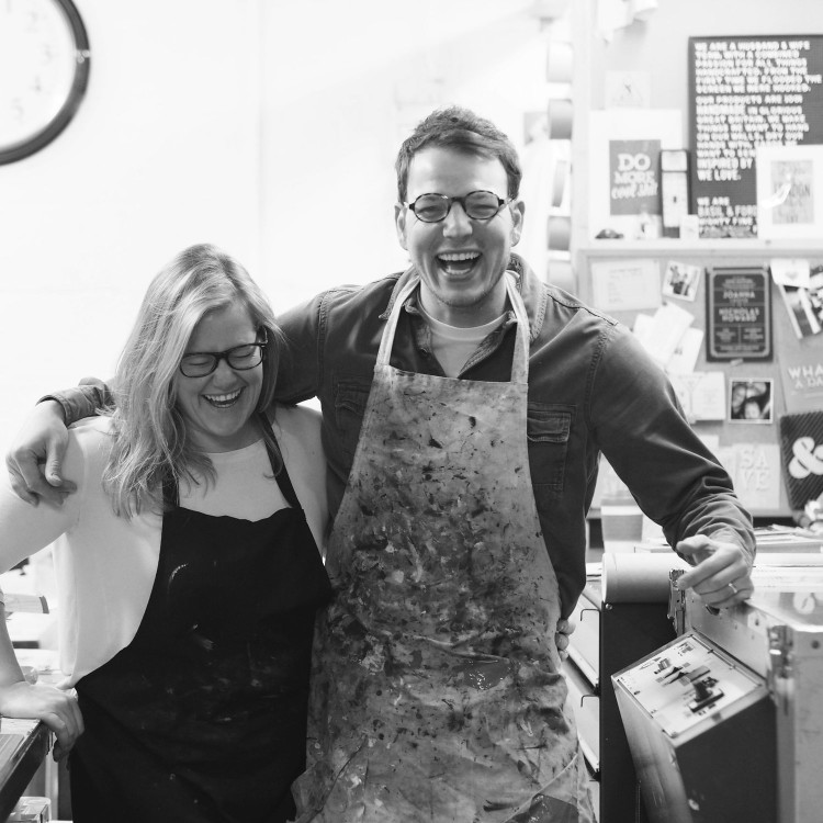
This March we are thrilled to welcome creative duo Basil & Ford to the East End Prints family. We had a chat with Matt and Lucy regarding their beginnings in the industry and the magazines we will for sure always find on their coffee table.
E: Hi guys, could you please tell us a bit about your background, how did you get interested in printmaking and how long have you been running Basil and Ford?
B&F:We first met back at Loughborough when we were on the Art foundation course, we fell in love and haven't looked back. Printmaking was always an element on the course but we didn't pursue it properly until later on. We both went up north to Leeds to study further, I studied Graphic Design at Leeds University and Lucy went to Leeds Met attending the Graphic Art & Design course, but spent most of her time in the photography dark room. Fast forward 10 years later, I finally asked for Luce's hand in marriage. Luckily she said yes. It was at this point we got a taste for screen printing. When looking to get our wedding stationery printed, we really wanted to use white ink, this was before the digital option was widely available. So we printed our own. It was then a year later when Lucy had fallen pregnant with our first little one, we decided to leave London and move back to Lucy's home town of Stamford to set up Basil & Ford. That was 5 and half years ago. Not many people know this but we're called Basil & Ford after the towns we were born. I was born is Basildon Essex, whilst Luce came into this world in Stamford.
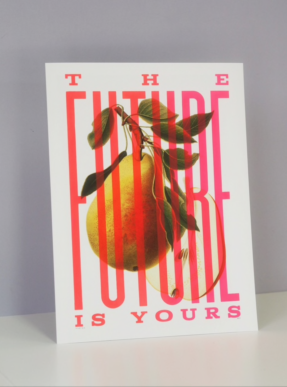
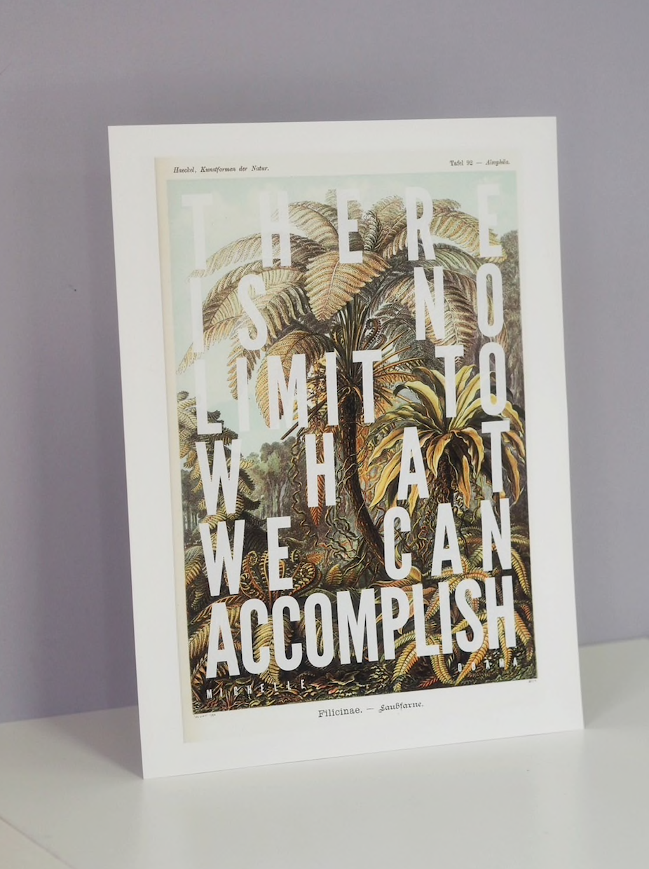
E: We love the contrast between image and text in your prints, do you remember which one was the first idea of this kind you ever came up with? What was the phrase?
B&F: I can't recall the very first book plate we printed on or even what the phrase was, but there is one phrase that I always remember coming up with. I had stumbled across a beautiful book titled ' THE BOY'S OWN BOOK OF WARSHIPS' written and most importantly illustrated by a chap called D.F.McDowell in the early 1950's. The book features 22 Royal Naval ships of the WWII era. The plates are just stunning, the colours are so vibrant and the illustrations themselves are like no other. I bought the book, not knowing what to print over the top of the pages, I adored the contents and knew they would become something one day. The book sat on the shelf for the best part of 3 years, and it wasn't until Donald Trump was being good old Donald Trump, this was before he was chums with Kim Jong Un and he sent his warships out in the direction of North Korean waters, the line 'MAKE WAVES NOT WARS' came to mind. It worked and we've been buying up copies of the book ever since.
E: What's the bestselling print of your range? Have you got a personal favourite?
B&F: Our best selling print to date has to be our 'STOP AND SMELL THE ROSES'. They are printed on to original vintage book plates of various roses, wondrously illustrated by Pierre Joseph Redouté. He was a prolific botanical artist in the late 1700's early 1800's. His roses images were reproduced by the Ariel Press across two publications 'Roses' and 'Roses II', the first editions were printed in 1956 and we try to source those editions and hand screen print the typography over the top. They did have other pressing years in 1966 & '76. We've printed on plates from across the print editions but it's the old ones that are the best in our opinion, the paper stock is like no other, the age of them can't be replicated. No two are really the same.
E: Humour seems to be a important part of your work. there is also a pinch of romanticism. Do you agree? Do you feel this two elements allow people to connect with the work in a different/special way?
B&F: We do agree. Laughter is the best medicine they say. So if we can create something that people pop on their walls that makes them smile or even laugh then we're doing something for the good. We like to keep things as simple as possible, ideally we choose lines or phrases that the reader will finish in their head. A song lyric, a saying, whatever it might be, they will then recall a good memory in time when they heard that or sung that line, so that's hopefully how our work resonates with our audience.
E: What should we expect form you in the near future? Are you working on something new at the moment? A new range or collaboration?
B&F: The likely hood is that you'll see a whole load of new lucky dips using old cigarette and tea cards. We did a recent run on some beautifully battered old cards featuring roses from the 1920's which have been well received. We've recently bought a whole load ranging from a variety of different subject matter, from birds and wildlife, butterflies, flowers etc. I have ideas to use old monopoly money too so they'll be printed on soon enough. We're also in talks with the V&A to create another limited edition for their up and coming show about food, but it's early days, so we'll see. I'm hoping to incorporate some beautiful illustrated Mrs Beeton's cookery pages.
E: Which magazines can we find on your coffee table?
B&F: Courier - A terrific showcase of small businesses / Pressing Matters - all about the art of print making / Undercover - A magazine by Umbrella - all about freelance graphic designers and creatives. All a brilliantly insightful and are worthy coffee table toppers.
E: Recommend us a book.
B&F: Our first little one is called Matilda, named after the infamous Matilda in Rhoald Dahl's classic, it was Lucy's favourite book when she was little, and I had never read it, so I read that to our Tilly when she was a baby, as she got older I read her all of his others books, which are just so magical and so well written, there is something for all ages in his works, so anything by Dahl is worth picking up. Our little boy Ted's favourite is 'POM POM gets the grumps' by Sophie Henn. Beautifully illustrated by her too. And another absolute cracker is 'UNDERCOVER' by Bastein Contraire. It's a stunning piece of work, the reader is challenged with spotting the odd one out on each page. All the illustrations are created in duo tone flouro green and pink with the overlaying colours making a third in the palette. It's a real visual wordless treat that sparks endless bedtime chats.


